OptiGrid is a centralised energy intelligence platform for the built environment. This guide is the single source of truth for how the brand looks, sounds, and behaves across every surface.
Introduction
1.1 What is OptiGrid?
OptiGrid ingests meter readings from offices, hospitals, schools, shopping centres, and industrial sites, then surfaces what is consuming energy, where it is wasted, and what to do about it. Real-time monitoring, anomaly detection, demand forecasting, and optimisation recommendations come together in a single dashboard-first experience, so operators stop reacting to bills after the fact and start making decisions on live data.
1.2 Our Vision
Make every buildings energy usage visible, predictable, and improvable - a future where operators have the same instrumentation for energy as they do for finance: real-time, granular, and acted on daily rather than quarterly.
1.3 Our Mission
Deliver a scalable, multi-tenant platform that ingests data from any meter or feed, detects inefficiencies, forecasts demand, and recommends cost-saving actions. Built on open standards so any building, large or small, can participate.
Logo & Iconography
2.1 Main Logo
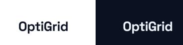
The wordmark set in Space Grotesk Bold. A dark variant (ink on light surfaces) and a light variant (soft primary on dark surfaces) exist - use whichever produces the higher contrast against its background.
2.2 Secondary Logo
A square OG monogram with the wordmark stacked below, built for compact placements: app icons, favicons, social avatars, and anywhere the horizontal wordmark would be illegible.

2.3 Logo Usage Rules
Minimum size - full logo: 24px minimum height. Monogram: 32x32px minimum.
- Never stretch or distort the logo
- Never recolour it outside the approved variants
- Never place it on a low-contrast background
- Never rotate it
Typography
3.1.1 Space Grotesk

Usage: headings, dashboard titles Source: Google Fonts Weights: 500, 700
Used for all headings, dashboard titles, the wordmark, and prominent calls to action. Its geometric letterforms and warm, rounded curves communicate a technical product without feeling cold or generic.
3.1.2 Inter

Usage: body text, paragraphs, form labels, button copy, table cells Source: Google Fonts Weights: 400, 500, 600, 700
Inter holds up at 12px and below, which matters for dense dashboards and metric tables.
3.1.3 JetBrains Mono
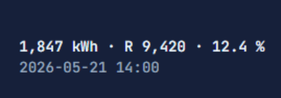
Usage: numeric values, kWh, costs, timestamps Source: Google Fonts Weights: 400, 500
Tabular-nums lining keeps columns aligned in tables.
3.2 Typographic Scale
| Style | Variable | Size | Usage |
|---|---|---|---|
| Display | --fs-hero | 3.25rem | Hero titles, landing pages |
| H1 | --fs-h1 | 2.25rem | Page titles, section headers |
| H2 | --fs-h2 | 1.75rem | Section headings |
| H3 | --fs-h3 | 1.125rem | Card headers, subheadings |
| Body | --fs-body | 1rem | Default body text |
| Small | --fs-small | 0.8125rem | Labels, captions, metadata |
3.3 Font Weight
| Weight | Value | Usage |
|---|---|---|
| Regular | 400 | Body text, paragraphs |
| Medium | 500 | Labels, subheadings, emphasis |
| Semi-bold | 600 | Buttons, important text |
| Bold | 700 | Headings, wordmark |
Colour Palette
4.1 Primary Colours

- Name
- Grid Teal
- Hex
- #4D869C
- RGB
- (77, 134, 156)
- HSL
- (196, 36%, 46%)
- Usage
- Primary brand colour, main actions, headers

- Name
- Meter Mint
- Hex
- #7AB2B2
- RGB
- (122, 178, 178)
- HSL
- (180, 28%, 59%)
- Usage
- Secondary brand colour

- Name
- Conductor Ink
- Hex
- #0B1120
- RGB
- (11, 17, 32)
- HSL
- (226, 49%, 8%)
- Usage
- Dark mode primary
4.2 Supporting Colours

- Name
- Daylight
- Hex
- #EEF7FF
- RGB
- (238, 247, 255)
- HSL
- (208, 100%, 97%)
- Usage
- Light mode backgrounds

- Name
- Surface Frost
- Hex
- #CDE8E5
- RGB
- (205, 232, 229)
- HSL
- (173, 34%, 86%)
- Usage
- Cards, surfaces, borders

- Name
- Night Primary
- Hex
- #8BB8E8
- RGB
- (139, 184, 232)
- HSL
- (211, 68%, 73%)
- Usage
- Dark mode accents
4.3 Functional Colours
| Name | Hex | RGB | Usage |
|---|---|---|---|
| Success | #2F7D5D | (16, 185, 129) | Positive actions |
| Warning | #B26B00 | (245, 158, 11) | Caution, pending actions |
| Error | #B23B3B | (239, 68, 68) | Destructive actions, errors |
Design Tokens
5.1 Spacing Scale
5.2 Radius Tokens
Components
6.1 Buttons

- Default: base styling
- Hover: darker background and overlay
- Active: pressed state
- Disabled: no hover
6.2 Input
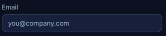
- Default: border colour
- Focus: border colour Grid Teal
- Error: border colour Error, error message
- Success: border colour Success
- Disabled: 50% opacity
6.3 Badges
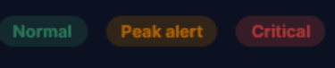
- Default: Grid Teal
- Success: #2F7D5D
- Warning: #B26B00
- Error: #B23B3B
6.5 Cards
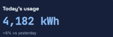
- Background - white (light mode) or Night Primary (dark mode)
- Border radius - --radius-md
- Shadow - --shadow-md
- Padding - --space-5
Design Principles
7.1 Clarity over Decoration
A user should read the most important number on a screen without scanning. Metrics are large, mono, and unambiguous.
7.2 Consistency
A button, badge, or card looks the same on every screen. Tokens, not bespoke styles.
7.3 Responsive
Every screen works from 360px upward. The sidebar collapses to a top nav below 768px.
7.4 Accessible First
Visible focus rings, labelled inputs, colour never the only signal. WCAG 2.2 AA minimum.
7.5 Quiet by Default
No carousels, no parallax, no modal-on-load. Motion limited to 150ms transitions.
Accessibility Standards
- OptiGrid targets WCAG 2.2 AA as the minimum compliance level; AAA is encouraged for body text where possible.
- All interactive elements are keyboard accessible.
- Form inputs have associated labels.
- The colour palette was chosen specifically to ensure accessibility.
Voice & Tone
9.1 Use Active Voice
Good: Add a new building. Avoid: A new building can be added.
9.2 UI Copy Guidelines
Button labels - use action verbs (Edit, Delete, Register, Compare); be specific (Add Building, not Submit).
Error messages - explain the problem clearly and provide a solution or next step.
Empty states - explain what should be there and provide a call to action.
9.3 Examples
| Context | Preferred copy |
|---|---|
| Empty building list | No buildings yet. Add your first building to start monitoring energy usage. |
| Error saving | Could not save changes. Please check all fields and try again. |
| Success action | Building added successfully. |
| Confirmation | Are you sure you want to delete this building? This action cannot be undone. |
Changelog
| Version | Date | Description | Author |
|---|---|---|---|
| 1.0 | July 30, 2026 | Initial release of the OptiGrid Brand Style Guide. Added Accessibility Standards, Voice & Tone, and Design Tokens. | Team Coreflow |